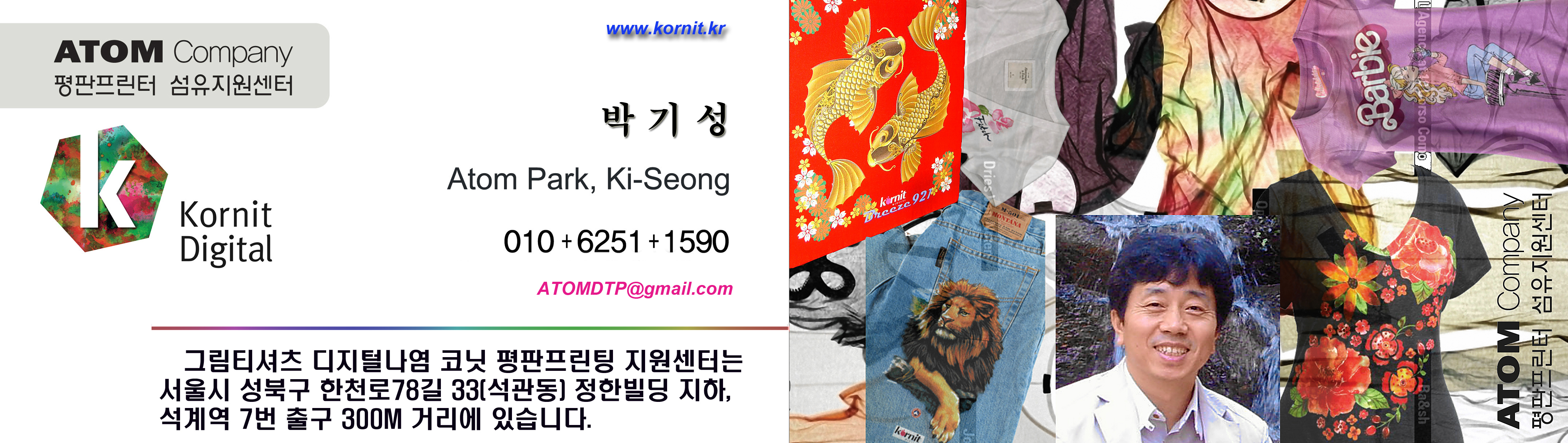
고정 헤더 영역
상세 컨텐츠
본문
[#인쇄용으로 디자인 할 때 피해야 할 6가지 실수#]
6 Mistakes You Should Avoid When Designing for Print
By M. McComic • February 29, 20200 Comment
[#그림티셔츠 DTG 평판프린터 코닛프린팅 지원센터 박기성 의역.]
인쇄 분야의 기업으로서 고객과 더 깊은 관계를 구축하려면 잘 디자인된 인쇄물을 만드는 것이 필수적입니다. 인상적인 고객 명단을 보유한 베테랑 인쇄 디자이너이든 방금 인쇄 사업을 시작 했든간에 성공을 위한 준비를 하려는 경우라면 고려해야 할 몇 가지 주요 검토 사항이 있습니다.
다음 인쇄 프로젝트를 진행할 때 모든 비용을 들여 피해야 할 몇 가지 실수가 있습니다.
As a business in the printing space, it’s imperative to create well-designed printed materials in order to forge deeper connections with your customers. Whether you’re a veteran print designer with an impressive roster of clientele or you’ve just begun your print business, there are some key considerations to take into account if you want to set yourself up for success.
Here are several mistakes to avoid at all costs when tackling your next print project.

#1. 올바른 도구에 대한 선택 실패 / #1. Failing to Invest in the Right Tools
평판이 좋은 디자인 소프트웨어 및 프린터에 대한 투자의 가치를 부정 할 수 없습니다. 여기에는 선택한 도구에 대한 기술과 지식을 완성하기 위해 충분한 시간을 할애하는 것도 포함됩니다.
There’s simply no denying the value of investing in reputable design software and printer for your business. This also includes dedicating ample time towards perfecting your skills and knowledge of the tools you opt for.
오늘날 시장에서 가장 인기 있는 디자인 프로그램에는 Adobe Photoshop, Illustrator 및 InDesign이 있습니다. 구입 비용이 많이 들지만 매력적인 인쇄 디자인을 만드는 데 필요한 모든 리소스를 제공합니다.
Some of the most popular design programs on the market today include Adobe Photoshop, Illustrator, and InDesign. While these may cost a pretty penny, they’ll supply you with all the resources you need to create captivating print designs.
만약:
인쇄 사업에 실질적인 영향을 미칠 프린터를 구입하려는 경우 염료승화전사 또는 DTG 프린터 (물론 개인의 사업 요구 사항에 크게 좌우 됨)를 고려해야 합니다.
If:
You’re looking to invest in a printer that’ll have a real impact on your print business, you should consider a dye-sub or DTG printer (which, of course, will be largely dependent on your individuals business needs).
염료승화전사 프린터는 티셔츠, 테이블 커버, 배너, 깃발 등을 포함한 폴리에스테르 또는 기타 합성 섬유에 인쇄하는데 사용됩니다. DTG 프린터는 의류 또는 직물 (일반적으로 티셔츠)에 그래픽을 인쇄하는데 적합합니다.
Keep in mind that dye-sub printers are used to print on polyester or other synthetic fabrics, including t-shirts, table covers, banners, flags, and more. While a DTG printer is great for printing graphics on garments or textiles (typically t-shirts).
#2. RGB 대 CMYK 색상 모드에 익숙해지기 / #2. Familiarize Yourself with RGB vs. CMYK Color Modes
이것은 신참들에게 흔한 실수입니다. RGB (빨간색, 녹색 및 파란색으로도 알려짐)는 빛을 사용하여 색상을 혼합하는 가색 색상 시스템입니다. 더 많은 빛이 추가 될수록 색상이 더 밝고 생생해집니다.
This is a common rookie mistake. RGB, otherwise known as red, green, and blue, is an additive color system that uses light to blend coloring together. As more light is added, the color will become brighter and more vibrant.
사업장에서 디지털 디자인 작업을 하는 경우 RGB 모드에서 작업 할 가능성이 높습니다. 그러나 인쇄 목적으로 새로운 디자인을 만드는 경우 RGB 기반 도구를 사용하면 원치 않는 골칫거리가 발생할 수 있습니다.
If your business is working on digital designs, you’ll most likely be working in RGB mode. However, if you’re crafting a new design for print purposes, using an RGB-based tool will lead to some unwanted headaches.
CMYK (시안, 마젠타, 노랑 및 검정)도 있습니다. 이 감색 색상 시스템은 잉크를 혼합하여 광범위한 색조를 생성하는 방식으로 작동합니다. 이는 전통적인 예술가가 물감을 캔버스로 옮기기 전에 팔렛트에서 혼합하는 방식과 유사합니다.
That’s where CMYK comes in (cyan, magenta, yellow, and black). This subtractive color system works by mixing inks to produce a wide spectrum of hues – similar to how a traditional artist mixes paint before transferring it onto their canvas.
CMYK 색상에서는 더 많은 잉크가 섞일수록 더 색상이 어두워집니다. 빛을 통해 생성 할 수 있는 색상의 범위가 잉크를 통해 얻을 수 있는 것보다 훨씬 넓습니다.
As more ink is mixed in, the color will become darker. The scope of coloring that can be generated via light is much broader than what is achievable via ink.
#3. 여분 블리드를 생각하지 못함 / #3. Not Accounting for the Bleed
불편한 흰색 가장자리를 좋아하거나 디자인의 중요한 부분을 잘라 내지 않는 한 블리드를 수용해야 합니다. 블리드는 배경 요소나 색상과 같이 문서 가장자리에 닿는 모든 것을 의미합니다.
Unless you’re a fan of unpleasant white edges or trimming off an important piece of your design, you’ll need to accommodate for the bleed. The bleed refers to anything that comes in contact with the edge of your documents, such as any background elements or colors.
디자인을 인쇄한 후 흠 잡을 데 없이 보이게 하려면 페이지 가장자리를 넘어 배경을 확장 (즉, 블리딩)하는 것이 좋습니다. 이것은 인쇄된 디자인을 적절한 크기로 트리밍 할 때 약간의 부정확성을 허용하기 때문에 중요한 단계입니다. 표준 블리드 크기는 일반적으로 약 3 미리입니다. 그러나 이 숫자는 궁극적으로 사용중인 프린터 유형과 최종 제품에 따라 달라집니다.
To ensure your design looks flawless once printed, you’ll want to extend (a.k.a. bleed) the background beyond the edges of the page. This is a crucial step, as it allows for minor inaccuracies when the printed design is trimmed to the appropriate size. The standard bleed size is typically around 0.125”. However, that number is ultimately contingent upon the type of printer you’re using and the final product.
# 4. 소재에 따른 컬러를 고려하는 것을 잊음 / #4. Forgetting to Consider the Material Color
디자인을 완성하는데 시간을 할애하다 보면 작업을 인쇄 할 소재에 대한 생각을 완전히 잊어 버리기 쉽습니다.
When you’ve dedicated hours towards perfecting your design, it’s easy to completely forget about the material your work will be printed on.
예를 들면 :
풀 블리드 컬러 배경은 화면에서 멋져 보일 수 있지만 인쇄 할 때는 어려울 수 있습니다. 사용하기로 선택한 소재 또는 인쇄 방법에 따라 복제가 엄청나게 어렵거나 사실상 불가능하다는 것을 알게 될 수 있습니다.
For example:
A full-bleed colored background may look stunning on your screen, but it may prove to be a challenge when it comes to printing it. Depending on the material or printing method you elect to use, you may discover it is incredibly difficult or virtually impossible to replicate.
# 5. 고해상도 아트 워크를 사용하지 않음 / #5. Not Using High-Resolution Artwork
인쇄용으로 디자인 할 때는 항상 고해상도 이미지를 사용해야 합니다. 저해상도 이미지는 화면에서는 괜찮아 보일 수 있지만 인쇄 한 후에는 격자 무늬가 보일 수 있습니다. 온라인에서 이미지를 검색하는 경우 인쇄 해상도가 완벽한지 다시 확인하세요. 인쇄를 위해 디자인을 보내기 전에 모든 요소가 고해상도인지 확인하십시오. 최종 제품에 당신의 모든 노력을 정확하게 묘사하기를 원합다면요.
When designing for print, you should always use high-resolution assets. Sure, a low-res image may look passable on screen, but after it’s printed, it’ll make you cringe. If you’re sourcing images online, double-check to make sure your print resolution is perfect. Before sending your design for printing, ensure all elements are high-res. After all, you want the final product to accurately portray all your hard work.
# 6. 글꼴 크기 및 두께 무시 / #6. Neglecting Font Size & Weight
일반적으로 글꼴은 8pt 이상이어야 합니다. 그러나 글꼴 두께도 계산에 포함되어야 합니다. 예를 들어, Helvetica Light는 매우 가는 선으로 구성되어 있습니다. 8pt에서는 읽기 어려울 수 있습니다. 두꺼운 글꼴에도 동일한 규칙을 적용하십시오. Impact 글꼴은 너무 작은 크기로 인쇄하면 번지는 매우 두꺼운 선을 사용합니다.
As a general rule of thumb, your font should be no smaller than 8pt. However, font-weight needs to be factored into the equation as well. For example, Helvetica Light is comprised of very fine lines – at 8pt., it may not be legible. Make sure to apply the same rule to heavier fonts too. Impact uses very thick lines that will bleed together if printed in too small of a size.
디자인은 많은 즐거움이 될 수 있습니다. 그것에 대하여 당신과 논쟁 할 수 없습니다. 그리고 자신의 인쇄 사업을 진행하는 것은 믿을 수 없을 정도로 성취감을 줄 수 있습니다. 그러나 이러한 일반적인 문제가 최종 제품 (멋진 인쇄물!) 사이에 끼어 들게 한다면 사업의 성장과 브랜드 평판에 확실히 도움이 되지 않을 것입니다.
Designing can be loads of fun – we can’t argue with you there. And owning your own print business can be incredibly fulfilling. However, if you let these common issues get between you and the final product (gorgeous printed materials!), it certainly won’t help your business’s growth and brand reputation.
About M. McComic ; Matt’s knack for the use of inkjet applications including proofing, promotional goods and signage came from the advertising world, where he managed the print and broadcast accounts for several key corporate accounts. Over 20 years at Imaging Spectrum, his experience has broadened in the print industry and now heads up the inkjet team in providing thorough solutions for printing opportunities across several platforms.
[상기 내용은 그림티셔츠 DTG 평판프린터 코닛프린팅 지원센터 박기성 이사가 실정에 맞추어 의역한 것입니다.]
#옷프린트(#옷프린팅), #그림티셔츠(#캐릭터티셔츠#커스텀티셔츠#그래픽티셔츠), #티셔츠프린터(#티셔츠프린트#티셔츠프린팅), #프린팅티셔츠(#프린트티셔츠), #단체티셔츠(#연애인티셔츠), #디지털프린터(#디지털프린팅#디지털프린트), #코닛프린팅(#코닛프린터#kornit#코닛프린트), #나염인쇄(#날염인쇄#스크린인쇄), #평판프린터(#평판프린트), #DTG프린팅(#DTG프린터#DTP프린팅DTP프린터)


